
A large selection of expert tips and advice to help you design and market the perfect web ..

Gradients are like gold when it comes to creating clean, sleek designs, This article hopes..

Heres a collection of actionscript scripts and codes to use as reference when creating dyn..

FlukeTube: The History of YouTube's Design
An interesting look at the history of YouTube and how it use to look in the early days, th..

The second in a series of help and reference guides, this one covers graphics design and h..


Tips and tricks for designing logos
Creating a logo design is a pretty exhausting task what with having to think of all those ideas and going back and forward with the client. But after reading this article I hope that it will become a little easier for you to knock out some pretty sweet designs.
its also good when showing the client to present at least 5-10 different versions, even if it's something simple like a change of colour or some font styling. Ive had many clients often ask to see a design with a slight change just becuase it was hard for them to visualise it in thier heads, I guess its the same for all clients and in the most part why they are hiring you.
So check out some of the examples below and hopefully you'll feel better next time you have to come up with a few good logos :)
Try flash drawing tools
If the thought of learning to use the drawing tools in Adobe Photoshop or Illustrator makes you sigh, try Flash, no really iam serious, Flash is also vector based the same as Illustrator but it offers a very different approach to design and illustration.
When you create a line or shape element in Flash everything stays seperated, even objects on the same layer are selectable. This is great for when your playing around with ideas and you want to just move things all over the place. Plus you can also export your final designs to loads of other formats including Adobe Illistrator when your done. Many of the logos you will now see have been designed using Flash.
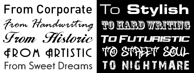
Fonts help Inspiration and Evolution.
If any of you have read the Graphics Design Guide you'll have heard me talk about how a good selection of fonts are great for both inspiration and evolution of your design style, updating your font folder with a few more additions every once in awhile will help you develop new concepts and ways of arranging information. Here’s a great selection of freely available fonts to play with (Font Collection, includes the ones above plus more! ).
Tip: If anyone comes to you with a design they’ve done using a font like "Times New Roman" it’s a good idea to grab their head, then grab a cold wet fish and slap it around their face a few times. This will hopefully jog their brain cells around enough to realise what they have done to the world!
Play with font layouts
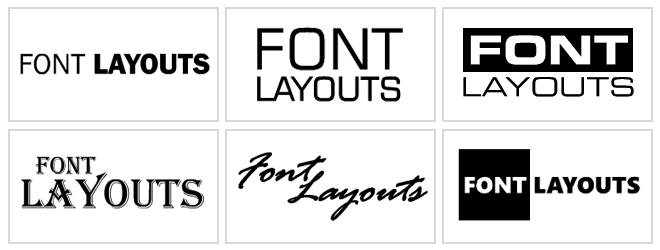
When trying to think of ideas for a logo be sure to play around with font types, just try grabbing the company or product name and stick some copies of it around the page, now give each of the text boxes a different font type, this can help you see what kind of font will be suitable for the words or particular brand.
Be sure to also experiment with various font formatting and colours, and as you’ve probably heard me say many times before, try to use closely related colours or a mixture of low contrast high contrast to avoid horrible tick tack style clashes.
Another way to play around with font ideas is to think about adjusting sizes, for instance if one of the words in the company name or service has greater meaning think about maybe making this bigger than the rest to emphasise it, (see some examples above).
For some more font styling effects see the tutorial Jazz up Text with Gradient Effects
Fonts can make a logo
These examples use the actual characters in the word to create parts of the logo, inspiration for design such as these will most certainly come from the chosen font type (the kind of moment when you say, hang on a minute that letter looks strangely like a…) then bang it hits you.
Play with shapes
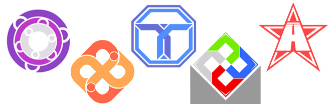
Now here’s a good one for corporate, less creative style logos, the use of shapes in different positions and colours can often give unexpectedly good results. When creating many of the above logos I have simply played around with the many drawing tools available to create some random shapes. I have then copied, rotated, and positioned them randomly until each of the shapes simple came together (I will often use this technique when I’m totally out of ideas and don’t want to use my brain cells too much he he.
Simplifying objects for logos.
Here’s one of my favourite logo techniques, it involves using objects relating to the product or service behind the logo itself. So for instance the pasta pronto logo above has a vector version of a pasta swirl, if you look closely you will see that this was simply created from a series of simple shapes but when you put them altogether it looks so effective.
Another example is the Quest tree (shown above), with this one I’ve probably decided to take the most complicated item in the known world (a tree). I guess at first glance this would seem like a nightmare, but using this simple shape technique I have managed to simplify it.. (I have also incorporated the use of the letter Q of the company name as talked about in the previous "Playing with fonts" section)
So try it yourself, find an image of an object that represents the logo or service your trying to put across, then draw around it and try to simplify it into a few different shapes. I will usually use the line tool in Flash for this one as it's easy to adjust your selections as you go. Once you have your shapes give them some colour and use your new found knowledge of font layouts and you'll be well on your way!
Send to a friend
