Some amazing footage of how Photoshop can be used to great effect..
Some great tips for how to go about designing your website with s..
If your learning Flash this is a must know, as it will help you t..
Panoramic images the easy way with Photoshop PhotoMerge
Creating Panoramic images from your photos is easier than you think, when you know how. So..
Create animated eyes that blink, wink and following the mouse pointer using Flash...
Iris Porthole Door Animation in Flash
Very cool effect that could be used for an intro or as an enter button for any web site...
How to transform a standard photograph for use with a specific colour scheme or brand imag..

So you’ve got your web site up and running with Google Adsense advertisements, but you not getting the click-thru rate you expected? Well this article hopes to share some of my experiences and other examples of how to position your forces and strategically draw your web sites users in and get them clicking that little bit more.
Now I don't personally claim to be earning huge amounts of money with Adsense but after integrating the techniques shown below into my sites, my click-thru rates have more than doubled in the past month, therefore I have doubled my Adsense income!
Here s a great technique for drawing users eyes towards your adverts, it involves using eye-catching but non-influential images above/below or to the side of an ad placement. Non-influential meaning that if you use anything that directly entices users to click on an advert such as an arrow or flashing text telling people to click the advertsrt you will get banned from Adsense.
Be careful with this one though as Google's program policies state the following that you "May not place misleading images alongside individual ads" So in order not to get caught out with this one I would recommend using subtle images relating to your content or that merge well with your sites layout.
You can find a great selection of universal symbols and shapes in Adobe Photoshop using the "Custom Shape Tool". Below are some subtle examples of how they can be used to make your adverts stand out that little bit more.
![]()
Of course common sense comes into this one a bit because slapping on advertisements that look nothing like your sites content with completely unrelated colours can make them stick out like a sore thumb, but in a bad way. I guess the true art of integrating them into your layout designs is to place them near your actual navigation links.
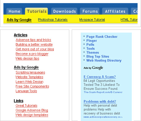
If you look at the example below, as your eyes pass over the top navigation you often can’t help but almost click the advertisements below, I guess this is because they have chosen a colour that both relates to their colour scheme but one that is slightly more intense than the navigation itself.
Below also has some great examples of using a link unit adverts in the same colours as your navigation, meaning that when users eyes gaze over your content they may treat these as further content links rather than invading advertisements.

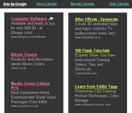
Now as you might have noticed this web site has some Google adverts of its own, located at the top and left hand side of the page you can see that I have chosen a slightly strange combination of colours.
My reason for adding this kind of effect to my advertisements came when I visited a random web site a few months back and was instantly attracted but this bright green text on the right, just as I was about to click on it I realized “oh this is an ad” then bang it hit me I just had to do this. A month later I have to say this was one of my best Adsense moves and has instantly boosted my click-thru rate.

All I can grasp from this is that users tend to like the use of bright colours on darker backgrounds, I guess this is common sense to most web designers, in order to make sure links are always visible, but obviously some colours like the above seem more visible and enticing than others.
Do you remember the old "Neon Nerds" sweets as a kid? With thier bright packing simular to the above, well now I come to think of it maybe that had the same effect on me and my pocket money back in the day :) anyway thats all from me ;)
More great Adsense related articles
Expert Adsense tips from Pro Blogger Darren Rowse
Comments (9)
Posted by: Anonymous on 04/09/2008
i was reading one of these comments, and it said they hate that people do this for money. LOL! why else would you do it, on top of that, if you have a website, push as many trickery adverts you can get away with.
Posted by: doob on 26/12/2007
A nice tutorial, the same thing could be done for Bidvertiser (latough they do not offer ad-link strips :( ) .
Posted by: Kirth on 19/09/2007
Good tutorial. The key to these ads is to pretty much relate the images to your content, and not just have a flashing image say "Click Me!!!" They typically increase your clicks, but positioning the ads in hotspots does just as well in my case.
Posted by: Ryne ( UPUP Media ) on 04/08/2007
hi i m shailesh, yes as u said using a link unit adverts in the same colours as your navigation is really tricky and works great without affacting your site layout and colours... hhummm very cool...
Posted by: Shailesh Mistry, India on 31/07/2007
Wow this is really good. Though I really hate people who just do this because they just want money.
Posted by: Grant Mead on 20/07/2007
It's true, thanks, but the Spanish group of Adsense Publishers are scared about that, because in a lot of Blogs, included www.marlexsystems.org my personal blog, the Adsense Program can go down the Accounts for that reason. Thanks for the Answer...
Posted by: Marlex Systems on 19/07/2007
Hi the Google program policies state the following that you "May not place misleading images alongside individual ads" So i guess the use of images all comes down to carefully choosing images that relate to your sites content and merge well with your layout, so it's a bit of a grey area :)
Posted by: Ben on 19/07/2007
Only a question... Adsense may delete the Accounts that use that Images near by the Ads? At least, in the Spanish version, Adsense will delete your account if you do that... Send me your answers to patrick (at) marlexsystems.org
Posted by: Marlex Systems on 19/07/2007
A great list of freeley available video encoding/converting software for converting AVI to..
The secret to good CSS layouts rests with the Float attribute. Using float instead of rela..
Learn how to detect keyboard input in flash for applications and game controls using a bit..
This tutorial will teach you how to create a dynamic rotating gallery within flash for sho..
Sometimes it is necessary to redirect traffic to a new webpage or a different site altoget..
Send to a friend
Cool some nice tips there ;)